Download approved logo files, preview the brand on light and dark surfaces, and follow the usage rules partners should keep consistent across decks, campaigns, and media placements.
These are the approved brand forms for most public-facing uses. Choose the version that preserves contrast and gives the lockup enough breathing room.
SVG files are best for product, web, and editorial uses. PNG files are included for slide decks, docs, media kits, and platforms that require raster uploads.
Transparent vector exports for flexible scaling across web, print, and editorial placements.
Approved raster exports for slides, social uploads, and third-party platforms that cannot accept SVG.
Use these for app tiles, marketplace cards, profile images, and favicon-style partner placements.
Square icon with a light shell for marketplaces, social, and app tiles.
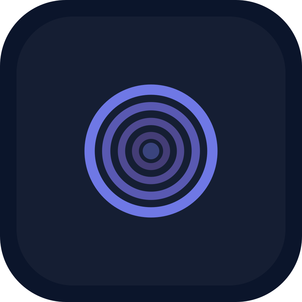
DownloadSquare icon with a dark shell for partner dashboards and dark canvases.
DownloadThe brand system is compact on purpose. Keep the logo clean, keep the surrounding typography restrained, and let the pulse rings carry the visual identity.
Primary outer ring
Secondary ring
Tertiary ring
Center accents
Dark wordmark and dark shells
Primary light canvas
Use for the QuadPulse wordmark treatment only. Keep the all-caps lockup with QUAD light and PULSE bold.
Use for hero headlines, campaign titles, and marketing headers around the brand.
Use for product copy, supporting text, captions, and partner documentation.
Keep at least one mark-width of clear space around the full lockup. No text, graphics, or edge crops should enter that zone.
The logo should feel precise and calm. Good brand use comes from contrast, spacing, and restraint more than decoration.
Use the light lockup on bright neutral surfaces and the dark lockup on dark surfaces.
Keep generous breathing room around the mark and lockup in every placement.
Prefer the full lockup for partner pages, sponsorships, and press assets where width is available.
Use the mark alone only when QuadPulse is already identified elsewhere in the same layout.
Do not stretch, squash, rotate, or re-proportion the mark or lockup.
Do not recolor the brand into off-palette tones or apply rainbow gradients.
Do not place the dark lockup on low-contrast dark backgrounds or the light lockup on pale backgrounds.
Do not add glows, bevels, outlines, or decorative effects to the official logo files.
Use the light lockup when the surrounding surface is dark and the logo needs to read clearly.
Use the default lockup when the background is light, soft, or editorial in tone.
Reserve the symbol for tight placements where the name already appears nearby.
Always keep the lockup at original proportions. Stretching or squashing weakens the pulse geometry.
Avoid alternate hues, multi-color effects, and unofficial gradients.
The lockup needs breathing room. Avoid tight boxes, edge collisions, and busy backgrounds.
Dark-on-dark and light-on-light placements reduce recognition and accessibility.
Start with the official files on this page, keep the approved contrast rules intact, and use the full lockup whenever the layout allows it. For co-branded campaign questions, use the approved assets first and keep the brand geometry untouched.